Following Google’s mobile update, more and more businesses with desktop websites are starting to see visitor numbers falling and enquiries dropping off.
The obvious answer to this is to build a mobile-optimised website but that takes time, and rushing it could do even more damage. What can you do right now to keep those enquiries coming in and keep your sales team happy?
To help you, I’ve detailed three quick steps that you can take straightaway. These will help you to assess the damage, plug the gap and get set to replacing your site with a mobile friendly one.
When Google bites:
3 tips to get your traffic back
1. Assess the damage
You’ve already identified that there’s a problem, the first step is to identify how big it is. Visitor numbers and enquiries are down but why? Google Analytics is the key and will have the answers we need. The steps I’m going to run through here relate to Google’s mobile update.
If you already have responsive websites and are still having problems, arrange a FREE growth assessment and we can tell you what’s wrong.
With Google Analytics we can discover exactly how many of your visitors browse your site on mobile devices. With this data we can work out what the damage is and how to deal with it.
Log in to Google analytics, and set the date range in the right hand corner of the screen. This sets a period for our analysis, the bigger the time period the more accurate the analysis; I would recommend a sample period of a year. Adjust the sample period to start this time last year and the end period to today.
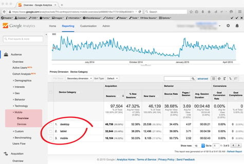
Next select the ‘Audience’ section on the left menu bar and then select the ‘Mobile’ and ‘Overview’ options. On the right hand side of the screen you will see how many visitors browsed your site on mobile or desktop.

If, as in the example illustrated you have tablets and mobiles listed in the device category, add the numbers for each of these together as they are both regarded as mobile devices by Google and are both served Google’s mobile search results.
This is the number of mobile users that visit your website and this is the number of potential visitors who will be affected by the update.
For a more detailed assessment of Google's impact on visitor number see also our blog 'Google Mobileggedon: 3 tips for tourist attractions'
2. Grap a lifeline
The reason your visitor numbers are down is because your positioning in Google’s mobile search results will have dropped. This means that your business is harder to find. The quickest way to fix this and see instant results is to start an Adwords campaign targeted specifically at mobile devices.
Even if your website is not mobile-friendly, a paid advert will appear above organically listed mobile-optimised websites. Search positioning that happens naturally i.e. without being paid for, is known as organic search positioning. If you pay for ads on Google’s mobile search network you will appear above the organic search results even though you have a desktop website.
How do you select mobile as the device in adwords?
When you create your ad in Adwords, there is a section titled ‘devices’ within the edit panel. If you click edit you have the option to select ‘all available devices’ or ‘advanced mobile and tablet options’. With the later you can set your ad to show only on mobile phones or tablets and you can even adjust your bid price (the cost you want to pay for each click) for different devices.
3. Now you’re afloat again,
start rebuilding your website
Adwords will keep those visitor numbers up, but only for as long as you pay for your listing, but it has bought you some time to start focussing on that mobile-friendly website rebuild. It may seem like a daunting task, and you may think where do I start? The simplest answer is to go back to basics and think about your audience.
The reason why Google is favouring mobile friendly websites in its mobile search results is that mobile optimised sites give users a better experience on mobile devices. Think about your website, try browsing it on your smartphone or tablet and identify areas that are difficult to use. Can your customers easily submit an enquiry with one hand? Do they have to scroll a long way to find a map to your location or to find your telephone number? If you can find the problems with your current site and answer them with your new mobile friendly website, then not only will you have stopped lost enquiries, you’ll be on the road to getting more enquiries as you offer your users a better experience.
Here to help
If your website is suffering from falling visitor numbers and enquiries are dropping off, read our free eGuide:
PHOTO CREDIT: Great White Shark - LOL News, Sinking Ship - www.frugal-cafe.com/


